
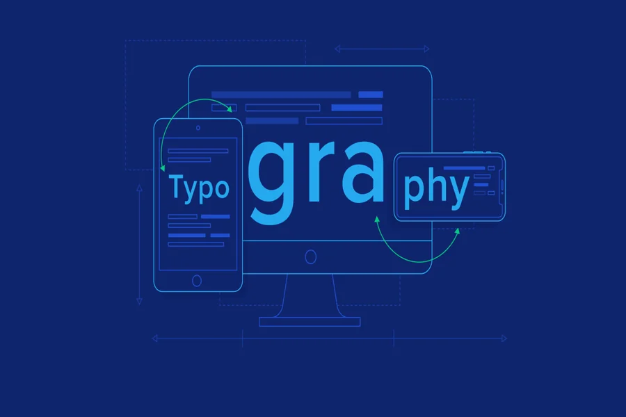
Typography is a critical component of web design that directly influences how users interact with content, perceive a brand, and navigate a digital interface. In modern web environments, typography must balance aesthetics, readability, performance, and accessibility across a wide range of devices and screen sizes. Choosing the right web fonts is not just about visual appeal, it is about creating a seamless reading experience that adapts to different contexts. Serif fonts are often used in web design to enhance readability in long-form content and bring a sense of tradition and clarity to layouts. Platforms such as TypeType provide professionally crafted web fonts designed to perform well across digital environments. This article explores the best practices for typography in web design, focusing on responsive behavior, hierarchy, spacing, and performance considerations that help designers create user-friendly and visually consistent interfaces.
Understanding the Role of Typography in Web Design
Typography in web design serves both functional and aesthetic purposes. It is responsible for delivering content clearly while also shaping the visual identity of a website. Unlike print, web typography must adapt to varying screen sizes, resolutions, and user preferences.
Effective typography helps users:
- Read content comfortably
- Understand hierarchy and structure
- Navigate interfaces efficiently
- Recognize brand identity
Poor typography, on the other hand, can lead to confusion, reduced engagement, and higher bounce rates. This is why typography should always be treated as a foundational element of web design rather than an afterthought.
Choosing the Right Web Fonts
Selecting appropriate fonts is one of the most important decisions in web typography. Web fonts must be legible, scalable, and optimized for performance.
When choosing fonts, designers should consider:
- Readability across devices
- Compatibility with browsers and operating systems
- Availability of multiple weights and styles
- Licensing for commercial use
- Performance impact on page load
Web fonts such as serif fonts are often used for body text in editorial websites due to their readability and structured appearance. Serif fonts help guide the reader’s eye across lines of text, making them suitable for long-form content. Additionally, web font collections typically include variations that allow designers to maintain consistency across headings, subheadings, and body text.
Establishing a Clear Typography Hierarchy
Hierarchy is essential in web design because it guides users through content in a logical and intuitive way. Without hierarchy, users may struggle to identify important information or understand how content is organized.
A well-defined hierarchy typically includes:
- Headings for primary topics
- Subheadings for grouping content
- Body text for detailed information
- Captions or supplementary text
Designers create hierarchy using differences in font size, weight, spacing, and contrast. Larger and bolder text is usually reserved for headings, while smaller and lighter text is used for body content. This structured approach improves scanability and ensures users can quickly locate relevant information.
Responsive Typography for Multiple Devices
Responsive typography ensures that text remains readable and visually consistent across different screen sizes, from mobile phones to large desktop monitors. Since users access websites on a variety of devices, typography must adapt dynamically.
Best practices for responsive typography include:
- Using relative units such as rem or em instead of fixed pixels
- Implementing fluid scaling techniques
- Adjusting font sizes at different breakpoints
- Maintaining consistent hierarchy across screen sizes
Responsive typography allows text to scale proportionally, ensuring that it does not appear too small on mobile devices or excessively large on desktops. This adaptability is essential for maintaining usability and accessibility in modern web design.
Font Size, Line Height, and Readability
Readability is heavily influenced by font size and spacing. If text is too small or too tightly spaced, users may experience difficulty reading content, especially on smaller screens.
Key guidelines include:
- Use a minimum font size of around 16px for body text
- Maintain adequate line height (typically 1.4 to 1.6 times the font size)
- Avoid overly long or short line lengths
- Ensure sufficient spacing between paragraphs
Proper line spacing prevents text from appearing cramped and improves the flow of reading. Additionally, maintaining optimal line length (around 45–75 characters per line) enhances readability by allowing users to track text more easily.
Limiting the Number of Fonts Used
Using too many fonts in a single design can create visual inconsistency and reduce clarity. A common best practice is to limit the number of font families to two or three at most.
Typical combinations include:
- One font for headings
- One font for body text
- Optional accent font for highlights or special elements
This approach ensures consistency while still allowing enough variation to establish hierarchy. Overusing fonts can slow down performance and create a cluttered visual experience.
Optimizing Web Font Performance
Web performance is a crucial factor in typography because fonts must be loaded before they can be displayed. Poorly optimized fonts can slow down page load times and negatively affect user experience.
To improve performance:
- Use modern font formats such as WOFF2 for efficient compression
- Limit the number of font weights and styles loaded
- Implement font-display strategies like swap to prevent invisible text
- Use system fonts where appropriate for faster loading
Efficient font loading ensures that text appears quickly and remains readable, even on slower connections. Performance optimization is especially important for mobile users who may have limited bandwidth.
Ensuring Accessibility in Typography
Accessibility is a fundamental aspect of web typography. Typography should be designed to accommodate users with varying visual abilities and reading conditions.
Important accessibility considerations include:
- Maintaining sufficient color contrast between text and background
- Using legible font sizes across devices
- Avoiding overly decorative fonts for body text
- Supporting zoom and scaling without layout breakage
- Structuring content with proper semantic HTML headings
Accessible typography ensures that content is usable by a wider audience, including individuals with visual impairments or reading difficulties. Following accessibility guidelines also improves overall usability and compliance with modern web standards.
Using Serif Fonts Effectively in Web Design
Serif fonts remain a popular choice in web design, particularly for editorial content, blogs, and professional websites. Their structured letterforms and subtle strokes can improve readability in longer passages of text.
Serif fonts are often used for:
- Articles and blog content
- News and editorial websites
- Academic or formal content
- Branding that requires a traditional tone
When used correctly, serif fonts can create a sense of authority and elegance. However, they should be chosen carefully to ensure they render clearly across different screen resolutions. Modern web fonts are designed to maintain clarity even at smaller sizes, making serif fonts more versatile than ever.
Line Length and Content Layout
Line length plays a significant role in readability and user experience. If lines are too long, users may lose their place when moving from one line to the next. If lines are too short, the reading experience becomes fragmented.
Best practices include:
- Keeping line length between 45–75 characters
- Using proper margins and padding
- Structuring content into readable blocks
- Avoiding overly dense paragraphs
Balanced layout and typography work together to create a comfortable reading experience that encourages users to stay engaged with the content.
Font Pairing and Visual Harmony
Font pairing is the process of combining different typefaces to create contrast and visual interest. In web design, pairing fonts effectively helps establish hierarchy and improve readability.
Common pairing strategies include:
- Combining serif fonts with sans-serif fonts
- Using contrasting weights and styles
- Maintaining similar proportions or x-heights
- Avoiding overly similar typefaces that reduce distinction
Good font pairing enhances clarity and ensures that headings, subheadings, and body text are visually distinct while still harmonious.
Common Typography Mistakes to Avoid
Even experienced designers can make mistakes when implementing typography in web design. Avoiding these issues helps maintain a professional and user-friendly interface.
Common mistakes include:
- Using too many font families in one layout
- Ignoring responsive scaling for different devices
- Poor contrast between text and background
- Inconsistent hierarchy across pages
- Overuse of decorative fonts in body text
Avoiding these pitfalls ensures that typography remains clean, readable, and effective across all contexts.
Conclusion
Typography in web design is a balance between functionality, readability, and visual expression. By following best practices such as maintaining hierarchy, optimizing spacing, ensuring responsiveness, and choosing appropriate web fonts, designers can create interfaces that are both aesthetically pleasing and highly usable. Serif fonts, in particular, continue to play an important role in web typography due to their readability and timeless appeal, especially in long-form content.
High-quality typography enhances user experience, strengthens brand identity, and ensures that content is accessible across different devices and audiences. When implemented thoughtfully, typography becomes an invisible yet powerful tool that guides users through content seamlessly while reinforcing the overall design system.